lit0ua
-
Posts
233 -
Joined
-
Last visited
Content Type
Profiles
Forums
Gallery
Events
Blogs
Posts posted by lit0ua
-
-
I enjoy warring, and I am looking for a F2P clan that is mainly based on warring. My combat level is 92, and I have no problems on joining as a Future Applicant until I meet the full requirements.
PS: It'd be better is the clan is purely F2P.
-
Not really a fan of LPs (if that's what you're gonna do with this) though it seems fair. Will wait for the finished product to give actual C/C.
-
It see it as some kind of "parody" to Runescape itself, correct me if I am wrong. The anatomy off matches pretty well the cartoon-ish style imo, though the faces could be enhanced a bit.
Also the guy on the back looks completely weird compared to his fellow signature-mates. Do everyone equally, with or without outlines but the same for everyone.
-
I actually like the old-school feeling it has. In this case I'd add text, mainly to fill in the blank space on the left.
Thumbs up for Breath of Fire as well.
-
How long did it take for you to do the first one?
No longer than 45 minutes, why?
-

Muk-like pinkish monster is not done yet, just updating to see what you think.
-
The one you did for N Odie is surely great! I'm not usually a fan of black outlines but they look good on that one.
-
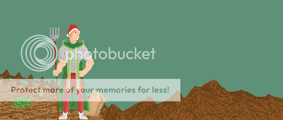
The pixel doesn't look bad imo. Just make the herb symbol bit bigger and place it a bit lower in the cape.
What is that things the guy is standing on? Also, knowing what was requested to you might help us give you suggestions on the background.
Can't really comment on the digipaint since that kind of art is unknown to me.
-
Haha I love the one on the left!
What exactly are you going to do to the one on the right?
I never really have something planned, I just let my imagination fly. I guess some kind of monster or something along the lines.
-
The one in your sig looks very good so far. Not a big fan of the other two though.
-
Been working a bit on my pixeling, trying new techniques and stuff. Here's one of my favorite pieces, to the left, and the one I'm currently working on, to the right. Feel free to give C/C and comments on them.

EDIT:

I don't tend to use many shades, if any. It's my style of work and I'd appreciate if you didn't comment particularly on that.
-
Your avatar fails too. <3 I was supposed to make you one for your birthday but I forgot. :P Will make something for you now that my skills have improved.
-
awesome/10
I luv ya. <3
I hate TGOP but I would play it only for you tbh. Fail Bank btw.
-
You're owning the comp with those fast fishing levels. :o Keep it up. :D
-
What's up with the white borders? :(
-
The white borders kill it. Otherwise I like it.
-
I like your noisy style. Looking good so far. :thumbup:
-
People don't come here to get pampered, as The Gallery we put things bluntly. I have never seen you in The Gallery before so please, let The Gallery be The Gallery and don't try change it.
I have probably been here longer than you. I don't post very often now, but if you go back some pages, you'll find plenty of my posts and art alike (which I'm not very proud of anyway). ;)
I for one am tired of people taking a factual or a 3D render and a picture from a game and pasting them into something and calling it "art". It's offensive really. I'm talking about a lot of the gallery in general though, not necessarily just the OP.
I agree, though it's what newbies generally do when they try "art". I used to do it myself, though I kind of grew out of it thanks to the CC and the welcome the gallery gave me. If you're new here, and when you post something you get flamed, it's probable you'll never post again and stop making "art". It's kind of our duty to be nice to the newcomers, I'm not saying we don't have to criticize their work.
Who knows, he in the future may be as good as some people here. We just need to give him a chance. :)
-
Way to scare both the Topic Author an Dallas alike from the Gallery, guys. LowFatMilk said he was new to the graphics universe, and he posted some of his art.
No. The last thing we need is people like Dallas claiming they have the knowledge required to help someone in this area and then doing the complete opposite. His work is awful, and that's the truth. If we have to be nasty, so be it.
Dallas didn't help him much artistically, but psychologically. We can't just go "that's horrible" like nothing, specially on the newer artists. We don't know how they take criticism. I understand that you have to be able to take it to post here, but god, he has like 15 posts, he most probably didn't even know how people are here.
Resuming: No need to be an [wagon]-hole when posting, specially with the new guys. No need either to flame Dallas, as Ouchy well said and you well quoted him, Art is an opinion, he may have liked the TA's work.
-
Way to scare both the Topic Author an Dallas alike from the Gallery, guys. LowFatMilk said he was new to the graphics universe, and he posted some of his art. The least we can do is guide him the right way, and I'm talking about CC, tips and tutorials, not flaming. Seriously, get outta your new-guys-suck and if-anyone-can-make-it-it's-not-art bubbles and start being a bit more polite when replying, or all you'll be doing would be getting the new artist to stop making art.
On the pieces:
-I'd suggest looking for some Text that matches the signature/theme. As Dallas suggested, Dafont.com is good.
-The 2nd one needs some smudgier edges, the choppiness ruins it. I suggest you use the Smudge Tool to try to make the Render merge with the Background, and not just look like it was pasted on it.
-Try finding C4D's that match with your render, or vice-versa. Alternatively, you can Smudge a nice BG, then add the render and smudge again.
-Look for Tutorials on the Net, they help you a lot; telling us which Graphics Program you're using helps us help you a lot more. ;)
Just keep practicing, and don't give up. Don't mind if people flame you, remember you're doing this because you like doing it. :thumbup:
-
+1 for keeping Zuperscape opened. :D
-
My 2 faves, though I agree they're very good.


And my most recent pixel, which I love and still need to finish.

-
Those look really good! What smudge settings are you using?
The default ones from PdN.
Thanks for the C/C Guys.
-
So I realized I had to try some more styles, and found one I quite like.
Here's just some work I'd like to share, and hopefully get some C/C to improve them. Also note the last one is still a WIP.
"Ectocave"

"Top of the World"

"Mountains"


Ancient Legion defeats Team Falcon
in Wars & Run-Ins
Posted
That last spam pic brings me to tears. It has such a positive feeling on it, the clan all together even on times like this. Anyways, good job guys. :)