


pjb21
-
Posts
1583 -
Joined
-
Last visited
Content Type
Profiles
Forums
Gallery
Events
Blogs
Posts posted by pjb21
-
-
only if theyll host the gif, i was planning on sending another piece (as yet unfinished, its a cartoon) but yeah, i could do that. problem is i dont know if its correct, the only image i had to work from was a thumb which isnt that detailed >_<
im not sure if it even has a stock... heh... :anxious:
PJB21
-
i never said i agreed with them or endorsed them doing so, and tbh its the less mature and newer meber who live up that reputaion. im trying to help the person, laughing at them doesnt get anyone, us or them, anywhere.
PJB21
-
as i said, check you can draw the pose using pen or pencil (im a clasic bic fan myself) if not change it, if so go for it, simple really =)
what year are you in? 11 or frst of 6th form? or left?
im currently in year 11 =)
-
too boring, if he (im guess your a he) can draw then let him!
-
hello once again, yes its that time, new 3D model, well i was thinking, sword are getting boring, lets make a model of something that you probably dont see that much. as of recent i have got more and more into range (i got full green hide (G), best i can get, and trying to get a willow comp ,most expensive ftw, if selling one pm me :wink:) anyways... ysp i made karils crossbow, or atleast a repeater crossbow thats similar.
im not really interested in CC on it or the animation, i just want to share.
a few stills =)
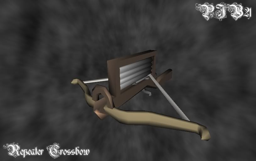
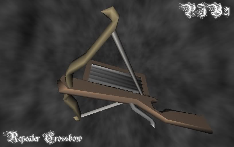
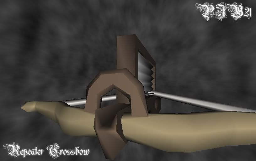
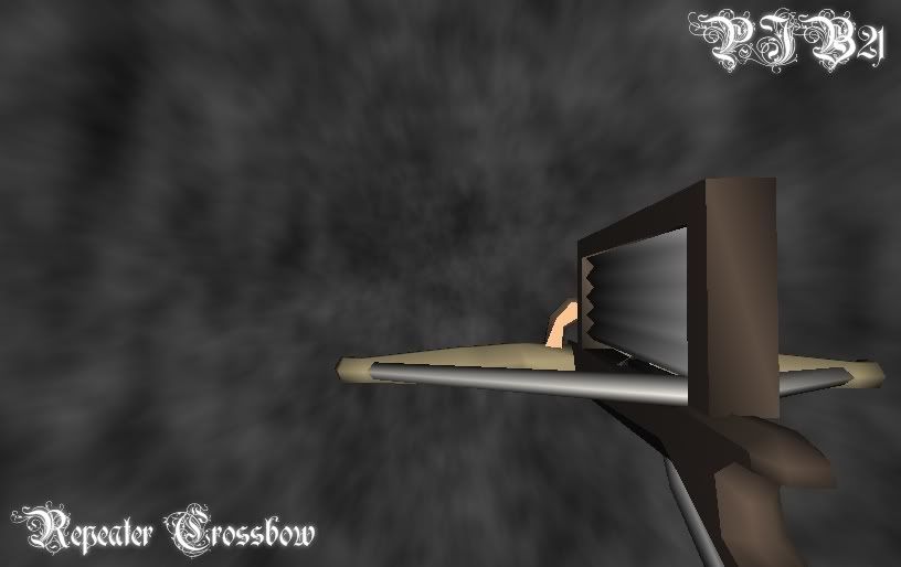
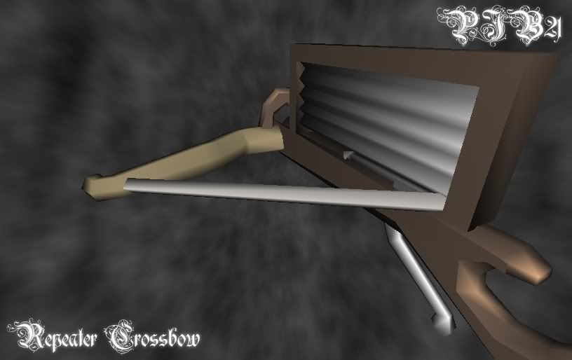
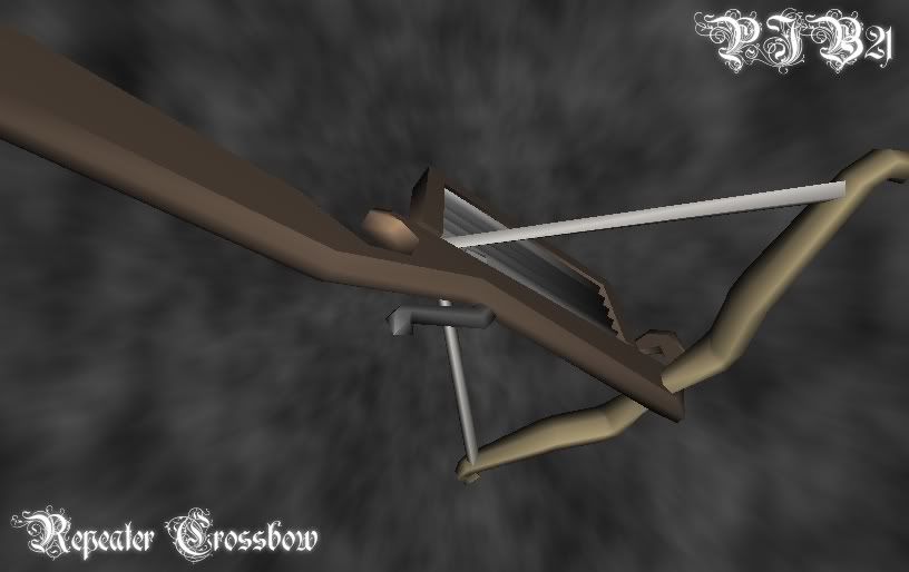
and of corse the animated, yes the speeds arnt realistic, and this was animated frame by frame moving the vartexes seperatly, while trying not to jog the camera...
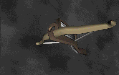
hope you all like it =)
PJB21
-
well, the good news is your english =)
a comical idea could be harpooning a log out of a bush or something, or trying to hack down a fish, heh... i make myself laugh, how sad is that :XD:
the idea of cutting the platform is good and hasnt been used, however it may give the wrong impression. the shark hanging has been used, and it was done fairly badly imo.
hmm, any more ideas that come to mind?
if your any good at firemaking you could be catching a fish while cutting a fire, dunno, that probably doesnt make sence. erm... dunno, if you like any of the ideas just say, or try think up some more =)
PJB21
-
and screen, i hate looking through a letter box >_
-
ok, your loss =)
and dont bother asking for a tut, i just kinda 'do' less with the thinking more with the experementaion!
ill quote myself,
i cant spell #-oor can i? hmm, anyways...
PJB21
google toolbar?
toolbars are the spawn of satan :evil:
-
this is the right forum.
ok starters, idea, what is your rs charachers main skills and what do you enjoy doing? always a good place to start, rather than making another cliche sig (like i so often do :XD: )
once you have an idea from that (i can help with the idea if you wish) youll probably want to draw it in pen or pencil, just to try different angles, check you can draw it well and it all works, best to do this quite a few times untill you can easily do it =)
now you open paint, personaly i do straight into linework, but thats me, if you want sketch the drawing in say light grey, just basicly (you can use pencil for this) next grab the line tool and the colour black =) basicly trace over the grey lines you drew (if you didnt then draw with the lines) when using the linetool, make lots of little lines, nothing says crap than really blocky, oh and when doing lines, never have them straight, so you wont be needing that shift button *rips it out*
once you have your lines you may be left with grey inside it, this is the cool part (or atleast i think its cool :wink:) load the fill tool and select grey as the colour. then left click in one area, and right click and repeat this untill the area is all white (or whatever bg colour youve chosen)
you saould now be left with some nice clean lines =) next selecting colours, i suggest you do this yourself, makes it more personal, rather than stealing someone elses. in my works each colour has 5 shades, highlight, base, 2 shades and and outline. fill your base colour in each section, then add your first shade, this should take up around 50% of the area, then do your second shade i the really darc areas, after this add the highlights where you feel apropriate. once finished you wont want those black lines, so use that final 5th colour (it should be darcwer than the darcest shade) and use the pencil or fill tool to change the sorounding lines to the right colour.
that more or less covers the basics, theres dithering and AA but dont bother with them, they arnt needed and are a waste imo :wink:
good luck and share your progress =)
oh and your welcome to view my gallery (click sig)
PJB21
-
ok, your loss =)
and dont bother asking for a tut, i just kinda 'do' less with the thinking more with the experementaion!
ill quote myself,
i cant spell #-oor can i? hmm, anyways...
PJB21
-
23rd is 11 days away, give peopel some time, ill definatly have something done.
on thing does it have to be pencil? like cants i do it computerly? if not cool, just wondering.
oih and im guessing biro is allowed... well shin used pen so i guess it must be...
PJB21
-
want the .pdn?
if so find an upload site thats free and doesnt need a subscription =)
i cant spell #-o
but yeah, its open to you if your interested, just dont rip =)
PJB21
-
cool =)
just a note for future, while its good to practise on the image they used, its often better to find your own for stuf you'll be posting, else people may get confused between the two, and accuse of ripping :wink:
PJB21
-
wasnt acusing you of anything, however you assesive defensivness is intreaging....
while were talking about it, mind talking me through how you did it? or posting the tut you used?
PJB21
-
i think most people are laughing at the sig as oposed to with it, if you get me.
tell me some stuff that you think would be cool in a sig, that reflect your character, things like that.
-
it could be saved as a png, it was simply decided not to i guess.... stupid jagex morons -.-
-
im wondering, the exploding plannet one, how much of it did you do in pdn?
-
well, lets be honest they arnt that new >_<
and yes, i do visit from time to time, but with alot of school work its been hard to go on, that combined with im finding the forums less interesting...
while i may not be doing many pixel art work, im currently part way through about 3 cartoons (that i'll probably never finish....) and have nearly compleated a 3D model i said id make and ill probably animate if i find the time =)
PJB21
-
shush :wink:
er, i mean... err... whos paul? :anxious:
heh *nervous laugh* heh
-
if that does your character justice you must have a crap character #-o
anaotmy isnt there, proportions are off , no shading, horrif colourings, at least you dont have messy lines.
but have a look in the top section for some good pixel guides and/or tuts and go from there.
PJB21
-
I went to paint.net and there is no program there. :-s
click the link in my sig :wink:
-
look really cool, however it could do ith a background, just a colour other than white will do. also more contrast in shading would be good =)
the bolt really needs work, and im not to sure about the cape... o0
also theres a few pixels you missed at the top of the sword =)
i really should update with some more work...
PJB21
-
love all these comics =) their great.
that brings me on to the point that a friend of mine has wrote a story that he wants me to help make into a graphic novel/comic kinda thing, however thats still a bit of a way of...
PJB21
-
woo! paint.net ftw!
not to bad a sig, rather basic, but again, not bad.
about the filesize you can do it yourself, when saving select jpeg and slide the bar untill the estimated filesize (under image sample) is below 30kb, then confirm by pressing save =)
i really dont like the text however, it doesnt fit well imo, go on dafont.com and find a good font (they have imstall instructions) then use that, however dont do what ive done, downloading loads and loads cos it can really slow down the time it takes to load the font selecter :wink:
im so proud of myself, i brought paint.net to this forum, have been a hardcore user since discovery, and thats to be the site (getpaint.net) is probably going over bandwidth, i love to advertise things, its soo fun =) it think it was gold who wrote that tut, he took on paint.net for a while, however im better =P
if you need help with anything or are stuck, or simply not sure with how to do something then feel free to let me know so i can try and help you, however it may be a few days before i reply (lots of school stuff going on atm...)
oh another thing, my sig was made 100% in paint.net (well the photo was taken seperatly) but yeah, its really cool. i advise browsing the forums, theres lots of good stuff there to be found =)
PJB21
new 3D model, inc animation =)
in Art and Media
Posted
i really should have edited the last post, meh... report me!
hehe :twisted:
anyways, i cant texture it, ive never been able to grasp how to, and i dont think i ever will. also low polys is kinda my trademark, it also means thay can be adapted for use in games where low polys and fast run time is needed.
as for programs, i used milkshape for the atual modeling and then microsofts free gif animtor for the animation =)
oh and the background was made in paint.net (simple clouds then off center zoom blur)
PJB21