July 5, 201115 yr How can I make the text in my signature more legible? I'm trying to keep within my clan colors. Here's the name by itself: I'm considering making a thin yellow edge. If no one has better suggestions in a while I'll do that and repost here...I'm looking for font suggestions now..
July 5, 201115 yr Noes! Do not add anymore outlines. That will probably just make the problem worse. I don't know if it's the font you chose or what, but the text just looks really blurry. So I think the only way to fix it would be to just change the font. Adding anymore stylistic stuff will just make it worse IMO. Honestly I think a new font would make the whole signature look better anyway. I think right now it makes a pretty cool looking background image look tacky :( On another note, I'm going to move this to The Gallery. It seems like you're just looking for input/suggestions and not actually needing someone to fix it for you. If I'm mistaken, let me know and I'll move it back :) - 99 fletching | 99 thieving | 99 construction | 99 herblore | 99 smithing | 99 woodcutting - - 99 runecrafting - 99 prayer - 125 combat - 95 farming - - Blog - DeviantART - Book Reviews & Blog
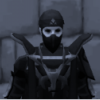
July 5, 201115 yr Author Perhaps you have tips for making the font clearer? I made it myself. It actually looks good smaller...There's no way I can just completely omit it! :( The clan's name is Bloodspray, IE that's the motif... The red splotch in the background was my best attempt with my current programs/knowledge.Ideally, I could keep the blurry, blocky font and get a thinner, wispy font to go on top of it.
July 5, 201115 yr The font looks blurry because all the edges are tapered out, you just need clean cut lines so the letters have defined outlines rather than merging out to just become blobs of colour. TBH I'd go back to the drawing board font wise because even ignoring the fuzz issues it doesn't read right.To me that says Bloo(infinity symbol)Spraq and with the blur the r is easily misread too which would make Bloo(infinity symbol)Sppaq. Also a common mistake that I think you've made based on "it looked good smaller" do NOT make the text object then just stretch it to fit as if it was an image. When placing text you change the font size until it fits.Resizing a text object to make it fit will blur and distort the lettering; changing the font size keeps it true to its original shape/form; plus most graphics softwares will anti-alias font edges anyway; which would cause excess blur if you changed the size of the object opposed to the font size. Operation Gold Sparkles :: Chompy Kills :: Full Profound :: Champions :: Barbarian Notes :: Champions Tackle Box :: MA RewardsDragonkin Journals :: Ports Stories :: Elder Chronicles :: Boss Slayer :: Penance King :: Kal'gerion Titles :: Gold Statue
July 5, 201115 yr I agree with the point that Sy_Accursed raised about the text. It's too blurred, which makes it undefined, and hard to read. It need to be 'clean cut'. In terms of the placement of the text on your signature, it appears like the text takes up too much room. There's thing behind it that we can see, but I have no clue what they are because of the text. My relaxation method involves a bottle of lotion, beautiful women, and partial nudity. Yes I get massages.
July 8, 201115 yr Author This is cleaner. I've removed the font, which was actually the same object stacked with different effects on each (not sure why I did that but I probably had a good reason).I've also removed the object behind the blood effect, as that was meant to be specific to each member who happens to use our signature on these forums.It's pretty obvious but I really just took our banner off our RS clan page and stuck things on it and cleaned the edges a bit.I'm not claiming to be a graphical artist, lol. All that you've seen on this page was either done in MSPaint or PowerPoint.Sidenote kind of thing, I can't find the exact version I have hosted as my signature... :???: I just want something that people will actually click on to link them to our clan page that might interest them in joining, and I'd like to keep it somewhat close to the original thought.
July 10, 201114 yr Use Paint.Net. It's better than standard Paint, and it is not very hard to pick up (compared to programs such as GIMP and Photoshop). It can be found here: http://getpaint.net My relaxation method involves a bottle of lotion, beautiful women, and partial nudity. Yes I get massages.


Create an account or sign in to comment