


andufusthebronze
-
Posts
2392 -
Joined
-
Last visited
Content Type
Profiles
Forums
Gallery
Events
Blogs
Posts posted by andufusthebronze
-
-
yes, He tried to beat me up for being a nerd. I got him expelled :)
-
I'm a boy
-
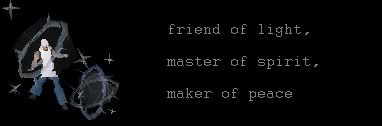
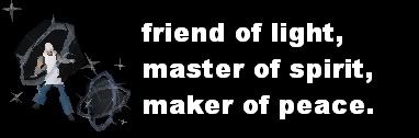
Size: Tip. It standard size
Background style: the swirly sample one
Background colors: black dark blue
Renderized image: http://www.netaxs.com/mhmyers/cdjpgs/earthshine.jpg
Text: friend of light, master of spirit, maker of peace.
Subtext: andufus
Font: ariel or something easy to read
Text color: silver
Sub text color: blood red
pretty please? :D
changed website, dont think its copyright
-
Ok, I'll watch all of those tutorials and see what i can do
-
my sig curently
-
hi, I started sig making today, and found it really fun. with the help from some people like rik on this forum I have improved my first Sig, which was blurred and rubbish into my sig now. So can you rate it, and tell me how to improve please. Oh, and please don't just view but post aswell. UNLESS your going to just insult me, or spam. thank you.
here it is

and can you say what you think of it seeing as I've been a sig maker less than 24 hours please?
-
its a hook!
-
lol, i have done it anyway.

-
ok these are the finished things


-
this is an updated pirate one i did
-
-
hi guys, I'm a newby sig maker and my mum is directiong peter pan and her favourite characters are the pirates, so i want to make a pirate sig. what should the text say?? Pirate talk like arrrr, so what you guys suggest?
-
thansk for your help guys, I'll post my future sigs on a diffrant thread, i think i know how to make decent sigs now :)
-
thats really good
-
xmas sig draft 2, darker writing added sparkles for effect
made a mystic creatures sig aswell, thinking of adding sparkels to everything so you know its my work, hm.... :-k
-
cool. now to work on the others
now pirate person, tell me what the text should be and i'll change it
-
I worked out what to do, I like it now. thanks for your help rik it looks so much better than the bigging product
this is the first one

this is it now

but i still prefer this one :?
-
argh, shut up. I don't care about pirate talk, it was supposed to be used for fun, not a political pirate debate.
-
so what do i do with the space then rick? what do you suggest?
-
It's my first sig!! but like what, you didn't make it clear. and the pirate can be as high up as i like, it's hook from peter pan hence the hook
-
ok cool, like this?
-
so, your saying if its a darker background use darker colours and if its a light background use lighter colours? i'll give it a go! ty for your helpful c/c
-
here we go, this is my second attempt for the first one
and i have changed the text and picture of the second one, it looks better now i think

and this is my xmas one :

I think it looks better, what about you?
-
ok, thanks i will try now!
P.C v.s Paper
in Art and Media
Posted
what is better for doing pixel art, because i like drawing on paper and am good at it, but doing computer art is ok, but I'm not very good at it :( and what do you prefer/think looks better
paper
or computer