July 20, 200917 yr I always feel like I can never get the c4d spam right... ^That was for a SotW elsewhere. So what do you think? ☢ CAUTION ☢ CAUTION ☢ CAUTION ☢ CAUTION ☢
July 20, 200917 yr I like the colours but i would get rid of the text on the first one. I think the images don't blend too good either, but i think the brushwork doesn't complement it and if you worked on that a bit they would look alot better. I also think the top one is cropped a tad too bit on the top, and the positioning of the figure in the 2nd one could do with some slight repositioning to the left. Very small things, i know - would be cool to see a 2nd version as i like the ideas alot :) Thank you to tripsis for an awesome sig!
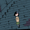
July 20, 200917 yr I like them, nice smidging, and not too many C4Ds. Just enough to get some nice flow and not distract you from the focal. So don't let anyone tell you you're not worth the earth, These streets are your streets, this turf is your turf, Don't let anyone tell you that you've got to give in, Cos you can make a difference, you can change everything, Just let your dreams be your pilot, your imagination your fuel, Tear up the book and write your own damn rules, Use all that heart, hope and soul that you've got, And the love and the rage that you feel in your gut, And realise that the other world that you're always looking for, Lies right here in front of us, just outside this door, And it's up to you to go out there and paint the canvas, After all, you were put on the earth to do this, So shine your light so bright that all can see, Take pride in being whoever the [bleep] you want to be.
July 21, 200917 yr eww manga lol, try some other renders/stocks Back to the c/c, i think the text on the first one looks quite good actually, although it distracts you from the focal. [hide]Felix, je moeder.Je moeder felixJe vader, felix.Felix, je oma.Felix, je ongelofelijk gave pwnaze avatar B)Felix, je moeder.[/hide]
July 21, 200917 yr Author eww manga lol eww manga lol eww manga lol What?! Haha, I don't feel like I would try my hardest if I used a game render ;___; Thanks for posting y'all. @Kingjoe: I think I'll keep those things in mind and make new ones with similar renders. The purple one's render position is too far to the side >__< @Insanity: Thanks =w= @Felix: Yeah, this other forum I go on absolutely loves text so I thought I could get some extra points =w= ☢ CAUTION ☢ CAUTION ☢ CAUTION ☢ CAUTION ☢
July 21, 200917 yr I think they're really good. The c4d's add great flow and the smudging is good. My only complaint is they're a bit monotone, but the second one isn't too bad with that.
July 21, 200917 yr eww manga lol eww manga lol eww manga lol What?! Haha, I don't feel like I would try my hardest if I used a game render ;___; Thanks for posting y'all. @Kingjoe: I think I'll keep those things in mind and make new ones with similar renders. The purple one's render position is too far to the side >__< @Insanity: Thanks =w= @Felix: Yeah, this other forum I go on absolutely loves text so I thought I could get some extra points =w= tbh you should siggy those try eww manga's [hide]Felix, je moeder.Je moeder felixJe vader, felix.Felix, je oma.Felix, je ongelofelijk gave pwnaze avatar B)Felix, je moeder.[/hide]
July 21, 200917 yr The C4Ds, colours and lighting look fine to me, you seem to have a pretty good eye for flow as well. I just don't like the smudging much, the settings look decent but IMO it would look a lot better if it was less of a linear gradient, and more of a texture with darker and brighter colours mixed in everywhere. Yeah, terrible explanation. #-o pixel avvy by me deviantART


Create an account or sign in to comment