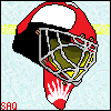
August 24, 200817 yr This is pretty much my first attempt at this style of art in the GIMP. I really like how it turned out though, but I didn't mean for his hands and feet to be so big. : C/C and whatnot? Background is red because it contrasted and on DevArt transparencies are weird... So no C/C on bad backgroud choice. :D DevArt Link: http://hawkxs.deviantart.com/art/Big-Foot-Cody-95769059 [hide=Full View][/hide] sig by Soa.....tip.it times.....art & mediadeviantart/flickr/last.fm/steam/twitter/tumblr/youtube
August 25, 200817 yr Hmm, I like it. I personally like how GIMP is so smooth on the edges compared to Paint. The only negatives I can put is the green thing on his head. It looks kind of out of place. You don't have to follow this advice from a complete GIMP nub though. :lol:
August 25, 200817 yr Thank you nadril. mean what te heck i this. To be honest, it looks like you haven't improved much. I mean, its really cartoony, which is in no means bad, but the way it is conveyed, and 6-year-oldish. You might want to try sharpening up the lines, and pay the heck close to anatomy. If you need real life pictures of things for anatomy, someone suggestd Marvel Comics. IN fact, there really good, I suggest you try them.
August 25, 200817 yr Yes, anatomy is extremely important. By the way, do you use a tablet? Using that in combination with pressure sensitivity settings (Like changing the opacity or the value/luminosity) would really, really help. I would suggest Wacom, it is generally accepted as the standard.
August 25, 200817 yr Author No, I don't have a tablet yet. I do really need one though. sig by Soa.....tip.it times.....art & mediadeviantart/flickr/last.fm/steam/twitter/tumblr/youtube


Create an account or sign in to comment