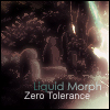
July 19, 200619 yr Made these a while ago, but still, rate please: I've posted these ones before, but I'll post them again for the people who haven't seen them:
July 19, 200619 yr Very nice. I don't really like the first one because some of the colors don't seem to fit, especially around the faces of the renders... Also, on the polar bear sig, there's a little bit of the render that wasn't cut right so it looks a bit choppy (right around the upper part of the arm near the head). Other than that, your sigs are wonderful. Great job!!
July 19, 200619 yr Wow, I liked all the text, it's rare to see text that looks so good on a sig. I agree. You did a great job on text... That's my worst quality, text... I hate my text... Yours is perfect though...
July 19, 200619 yr Woops, you also wanted a rating... so... 7 sigs, 10 points each... 60/70 ... just because that last one is a greenday sig.
July 19, 200619 yr those are all very good! :shock: Listen to the mighty words of Bloodredsword. Tip it MGC Xbox live leader board!
July 19, 200619 yr Author Wow, I liked all the text, it's rare to see text that looks so good on a sig. I agree. You did a great job on text... That's my worst quality, text... I hate my text... Yours is perfect though... You think? :-k I always thought text was my bad-side. \
July 19, 200619 yr ya man those are awesome 10/10...my photoshop cs2 is messed at the moment, hopefully ill have it up soon :) http://www.onestepforum.com/gamersuniverseGreat Gaming Forum :)
July 20, 200619 yr Wow, I liked all the text, it's rare to see text that looks so good on a sig. I agree. You did a great job on text... That's my worst quality, text... I hate my text... Yours is perfect though... You think? :-k I always thought text was my bad-side. \ It's better than mine... I can never pull off text...
July 20, 200619 yr very nice, do u sell them or would ya make me one free :-w Against the rules to sell sigs so if you do get a sig, it should be for free...
July 20, 200619 yr 1. Too much of a clash between colors and it is really hurting my eyes. 2. This one looks descent, but the text is near unreadable. 3. Again, too bright. The text doesn't fit at all in my opinion. 4. This one is nice, but there are too many colors again, try to stick to a two/three color theme. 5. You have a color theme and the render is blended nicely. Though i dont like how its just really white in that bottom right hand corner. Text could also have some consistency by using the same font or two fonts that look the same. 6. Best one of the lot. The robot was brushes nicely in the background and fits perfectly in the foreground. One thing i might recommend is cleaning up those stray blood-red lines near the text. It makes it hard to read. 7. All i have to say is, why did you mix red and teal with an ugly shade of tan? axeraider70.deviantART.com
July 20, 200619 yr 7.5/10 for the collection. Some of 'em are very good some of em less. Lovin'the second one though :3> TIP: When the sig doesn't work out the way you want - don't save it - start over :)
July 20, 200619 yr Author 1. Too much of a clash between colors and it is really hurting my eyes. 2. This one looks descent, but the text is near unreadable. 3. Again, too bright. The text doesn't fit at all in my opinion. 4. This one is nice, but there are too many colors again, try to stick to a two/three color theme. 5. You have a color theme and the render is blended nicely. Though i dont like how its just really white in that bottom right hand corner. Text could also have some consistency by using the same font or two fonts that look the same. 6. Best one of the lot. The robot was brushes nicely in the background and fits perfectly in the foreground. One thing i might recommend is cleaning up those stray blood-red lines near the text. It makes it hard to read. 7. All i have to say is, why did you mix red and teal with an ugly shade of tan? This is not a flame, or an attack in defence, but, the gods honest truth from myself: 1. Your eyesight must be poor then, seriously. :shock: 2. Unreadable? You've got to be kidding me? 3. Agreed. 4. Don't agree tbh, multiple colours are quite nice in my opinion and quite a few others. 5. Agreed, but the white thing I blame on the brushing overlaying I did. 6. Tbh, I think it's decent - to an extent, I thought it wasn't as good, it didn't look as much, alive and had too much of a dark tone to me. 7. Huh? :?




Create an account or sign in to comment