May 10, 200719 yr Ugh with all the neesh-neesh going on, I decided to try pixelling again. So this is where you (mainly the great pixel gods) come in. I need some serious C/C. This will change with updates: Added basic color so you can recognize what the stuff is. This was supposed to be a joint signature, a.k.a. I do the lines, my partner does the color, but my partner had to pull out so I'm left with the coloring too. The breasts are not round because if they were and the touched each other, then that person would of have a boob job. WHAT YOU NEED TO TELL ME Does everything look recognizable. If anatomy is correct. And any other C/C. [hide=9th May Numero #1][/hide] [hide=10th May Number #2][/hide] [hide=11th May Number #3][/hide] [hide=18th May Number #4][/hide] ☢ CAUTION ☢ CAUTION ☢ CAUTION ☢ CAUTION ☢
May 10, 200719 yr Ok...Other than the anatomy errors, you have major perspective ones, too. The line of the slope of the hill could be lowered a lot. Right now, it looks like I'm looking from below. The two girls are at different angles from each other and the nearer one's upper body has a different perspective than the rest of her body. The one that is farther away looks like she is somehow on a wall (almost, it's like an 80 degree angle lol). The tree roots are way off, they should look like they're going into the ground, and need to be thicker. I like the items, they're not perfect, but they are recognizable. The skirt is a bit big compared to the rest, and the waist area is way too small compared to the rest. I hope these girls will have clothes when this is finished, and I think you need to get rid of the thick lines, and do 1 px lines..They'll look better, in my opinion. Ok, now fix it up! :XD: [EDIT= no, I'm not going to say which girl is sexier, lmao.. :uhh: do u wow?Cassiius|Level 70 Night Elf Preist|RunetotemSambora|Level 37 Tauren Shaman|BurningLegion
May 10, 200719 yr Ok...Other than the anatomy errors, you have major perspective ones, too thats basicly the first thing that came to mind when i saw this picture, you really need to choce one angle, and make sure they all line up with that perspetive. the skirt, not bad, but you can tell its there, once you add color it will be much easier to tell things apart, but the perspetive is always ganna looks weird i dont think that a crude out line is very sexy, no matter how good it is.
May 10, 200719 yr remember the golden rule to difer between men and women. women have hips wider than their shoulders, a more rounded body (sometimes described as a pear), smaller hands, and make the breasts a bit more up, for now it looks like theyre falling off :? Click my main sig to see my fakes :D Proud to be Mexican, yay!
May 11, 200719 yr Author Okay I know for sure I have perspective issues. In my drawings of still life it looks wrong. I added a new girl because I wanted to see one in that position. Also added bikini's because they were to kinky naked. Adjust dragonskirt. Changed left person's position slightly. Tried to make her look more natural. She looks too big. The top right person still looks slanted >.< Sort her our tomorrow. Omg! Their legs look totally distorted! Nuuuuu. Ugh .. I can see soo many anatomy errors. Also I need some help with perspective. I tried to take advice, just I'm can't do perspective. It should sort be like this the finish result: No I just realized, the dragon items/party hats may be too big! ☢ CAUTION ☢ CAUTION ☢ CAUTION ☢ CAUTION ☢
May 11, 200719 yr I edit some of the lineart for you, I hope I didn't butcher it or anything >_< Ultra Unholy,Hearted Machine...
May 11, 200719 yr Author Thanks so much Echo! Your so much better at anatomy than me. Update: Worked off what Echo did, just made the bottom right girl's booty bigger. The items look a bit weird to me .. the party hats look so wrong, I'll have to change them. Oh and the girl's head looks awkward. C/C away please. ☢ CAUTION ☢ CAUTION ☢ CAUTION ☢ CAUTION ☢
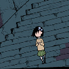
May 18, 200719 yr Author Update: C/C Please! Hah I found an old signature done ages ago by me and same person who should of been doing this one: Don't C/C that ^ ☢ CAUTION ☢ CAUTION ☢ CAUTION ☢ CAUTION ☢
May 19, 200719 yr It's coming along nicely, I'd make the items a bit smaller if they are gonna be added to the sig. Looking forward to seeing the finished piece ;):P
May 22, 200719 yr Author Cheers Ben! I was making the items smaller but they looked weird, so I'm going to re-do them so they looked stack on each other. I loathe shading and colour .. I can't do it >.< but I will attempt. ☢ CAUTION ☢ CAUTION ☢ CAUTION ☢ CAUTION ☢


Create an account or sign in to comment