December 7, 200817 yr ... I also made my very first pixel. I studied a lot of tutorials for it, I know that the perspective is off and the sky colors are weird, but I seriously don't know how to make it better. But still, some (nice) C/C would be helpful and some nice little ratings. BTW, if anyone of you wonders, I made that little piece a whole 3.5 hours in GraphicsGale. The dithering took most of the time... EDIT: V1: V2: So I've noticed this thread's regulars all follow similar trends. RPG is constantly dealing with psycho exes.Muggi reminds us of the joys of polygamy.Saq is totally oblivious to how much chicks dig him.I strike out every other week.Kalphite wages a war against the friend zone.Randox pretty much stays rational.Etc, etc
December 7, 200817 yr Nice colours, though you've dithered where it isn't really necessary. The car looks odd aswell :roll: 2257AD.TUMBLR.COM
December 7, 200817 yr Author You mean the dithering part about the sky dithering? And if anyone doesn't dig it, I meant to make snow in front of the car. So I've noticed this thread's regulars all follow similar trends. RPG is constantly dealing with psycho exes.Muggi reminds us of the joys of polygamy.Saq is totally oblivious to how much chicks dig him.I strike out every other week.Kalphite wages a war against the friend zone.Randox pretty much stays rational.Etc, etc
December 7, 200817 yr Yeah, looks really strange IMO, I would make a gradient for the sky, anti aliasing the colour bars if you like? You know what I mean? 2257AD.TUMBLR.COM
December 7, 200817 yr Author Yeah, I said I've read a lot of tutorials before making this avvy, I know what anti aliasing is. But I never thought of that while making the sky... :? So I've noticed this thread's regulars all follow similar trends. RPG is constantly dealing with psycho exes.Muggi reminds us of the joys of polygamy.Saq is totally oblivious to how much chicks dig him.I strike out every other week.Kalphite wages a war against the friend zone.Randox pretty much stays rational.Etc, etc
December 7, 200817 yr I like it, nice retro feel to it. danke Schon Sam!^^"Blood runs thicker, oh were thick as thieves you know"-Carl Barât
December 8, 200817 yr In pixel art, anti-aliasing is used to minimize the "jaggies" and similar artifacts by applying some simple smoothing. http://www.natomic.com/hosted/marks/mpat/aa.html Dithering isn't necessary to create a pixel art gradient, but it uses less colours, so it's usually the preferred technique (in other words, you were right to use dithering in the sky). In your sky, though, it's a little to noticeable. You should either tone down the colours so that they don't contrast so harshly (particularly the cyan), or add in another tone to create a smooth effect. It sort of looks like its driving over an aquarium. It's pretty cool (great technique for glass) but probably not what you intended. Snow doesn't reflect so easily, and at that perspective the horizon would be much lower. The road wouldn't be visible at all. Great start, though. :thumbup: I agree with Thru, looks very retro! Focus on perspective in your next one. PS: Love the car. Looks like a sweet low-rider.
December 8, 200817 yr I'm not going to go into the perspective errors and such, but I think you need to add in some textures. Snow is fluffy and choppy, much like grass. So, overlap your dithering layers and use random, choppy strokes instead of precise dots. The car needs a few highlights as well- little streaks of light where two plates of metal meet. Make sure to use only one per edge, though. It's great that you actually tried out dithering in your first pixel, though. Here be dragons ^ Dragon of the Day
December 8, 200817 yr Why does the sky go from green to blue to yellow? Last time I checked the sky is just blue? Also, the front of the car looks elongated, and the curve when it tapers off is too sharp. quit
December 8, 200817 yr Author So... Highlights, perspective, sky colors and texture are main problems here? And this was just a try, this car wasn't meant to be realistic. Anyways, I have always been very bad at getting a perspective. It is my main problem at art classes too. So I've noticed this thread's regulars all follow similar trends. RPG is constantly dealing with psycho exes.Muggi reminds us of the joys of polygamy.Saq is totally oblivious to how much chicks dig him.I strike out every other week.Kalphite wages a war against the friend zone.Randox pretty much stays rational.Etc, etc
December 9, 200817 yr Author V2 is up. Now could you see any progress or something like that? Which one you like the best? Most helpful were venomai and Lexi, I would love to keep getting good C/C from you. So I've noticed this thread's regulars all follow similar trends. RPG is constantly dealing with psycho exes.Muggi reminds us of the joys of polygamy.Saq is totally oblivious to how much chicks dig him.I strike out every other week.Kalphite wages a war against the friend zone.Randox pretty much stays rational.Etc, etc
December 10, 200817 yr You highlights probably need to follow the curve of the car. Like the picture. AS for the snow, it would probably look better if you used a spray can... ...just don't over use it. Go one color at a time, darkest to lightest, with higher concentrations of light colors where the sunlight touches the snow. Here be dragons ^ Dragon of the Day
December 10, 200817 yr Author Z0mg, I've gotta use MS Paint for that... And it makes my computer lag if I have too much programs open at the same time. Well, anyways, I also have another sig start, which I would like to get C/c on perspective. I think something is very wrong here, but I don't know how to fix it. Anyone who knows a bit about this, could help. So I've noticed this thread's regulars all follow similar trends. RPG is constantly dealing with psycho exes.Muggi reminds us of the joys of polygamy.Saq is totally oblivious to how much chicks dig him.I strike out every other week.Kalphite wages a war against the friend zone.Randox pretty much stays rational.Etc, etc
December 10, 200817 yr Author A Bump, seeing that Venomai is online. So I've noticed this thread's regulars all follow similar trends. RPG is constantly dealing with psycho exes.Muggi reminds us of the joys of polygamy.Saq is totally oblivious to how much chicks dig him.I strike out every other week.Kalphite wages a war against the friend zone.Randox pretty much stays rational.Etc, etc
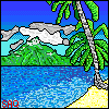
December 10, 200817 yr Well, anyways, I also have another sig start, which I would like to get C/c on perspective. I'm no master of perspective, but I can give you a few pointers that might help you along. It looks to me like a mountain pass and a stream. If so, there are some things to keep in mind: To create depth, you should be using linear and atmospheric perspective. Read up on it here: http://daphne.palomar.edu/design/space2.html A simple example using a photo: Notice how the river gets thinner as it gets farther away? It "converges" to a single point (called the vanishing point). Also note how the mountains in the distance, behind the river, become more and more faded (atmospheric perspective). Notice how low the horizon is? (The horizon is basically the vanishing spot of the river, at the base of the larger mountains.)
December 11, 200817 yr The river is needs to get much wider on the 'bottom'. Also, it should be curving arround the mountains, not in a straight line. The general positioning of the river (on the far right) and the lack of texture (I realise this is going to be added later) makes it hard to visualise a sense of close and far. The sky is oversaturated. The mountains/hills are much too pointed. They generally shot bare rock(gray) at the peaks. All I did was 'mirror' the part with the river, then make it wider. (sorry if it feel's like I'm trying to hijack your image, just trying to help!). I think it looks more correct. quit
December 13, 200817 yr Author I meant that thing to be a Fjord, not a river. Fjords go like this to the mountains, and between the mountains, the big part is the sea. I know that everything is oversaturated, and I know what mountains look like. This was only a bit of a linework with color, to show you what that thing is. So I've noticed this thread's regulars all follow similar trends. RPG is constantly dealing with psycho exes.Muggi reminds us of the joys of polygamy.Saq is totally oblivious to how much chicks dig him.I strike out every other week.Kalphite wages a war against the friend zone.Randox pretty much stays rational.Etc, etc
December 14, 200817 yr Fjords have pretty much the same look, just with an even wider opening (a lake, rather than a stream). http://z.about.com/d/cruises/1/0/2/K/3/ ... jords2.jpg https://secure.reservexl.net/wwwimg/img ... 2593-2.jpg http://www.exotic.to/photos/norway_fjords.jpg
December 14, 200817 yr A little bit strange, but a good start nonetheless :) Pixel sigs are really good when done properly, but require alot of time and patience ;)




Create an account or sign in to comment